Banner 1
Creating the logo for a new makeup company proved to be quite the challenge, especially for a college student like me. As I prepared to present my work to Professor John, who had been mentoring me throughout the process, I couldn't help but feel a mix of excitement and nervousness.
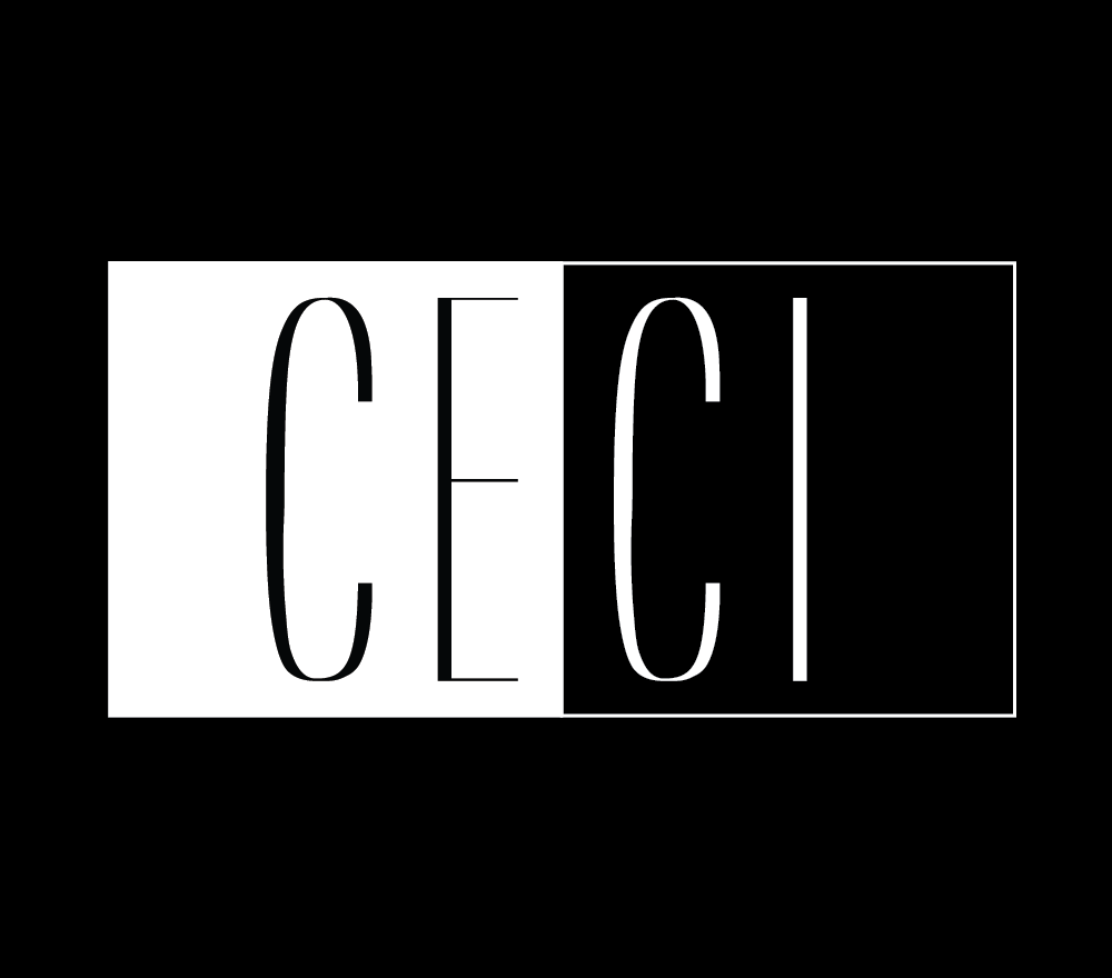
During our meeting, I showcased my designs for Ceci Cosmetics, explaining the thought process behind each iteration. As I spoke, Professor John nodded thoughtfully, his keen eye for design evident in the way he analyzed my choices.
When I reached the part where I discussed my intuition for using black and white elements, Professor John's interest was piqued. He encouraged me to delve deeper into this concept, guiding me to explore the power of contrast and simplicity in design.
Taking his advice to heart, I refined my designs, focusing on clean lines and bold typography to convey sophistication and elegance. With each iteration, I sought to capture the essence of Ceci Cosmetics while ensuring versatility across different platforms.
Finally, I presented the final logo—a sleek, monochromatic emblem that I believed truly represented the brand's identity. As Professor John examined it, I held my breath, anxiously awaiting his feedback.
To my relief and joy, he nodded in approval, praising the simplicity and elegance of the design. His validation was a testament to the growth I had experienced throughout this project and the invaluable guidance he had provided along the way.
Leaving the meeting, I felt a sense of pride knowing that I had successfully translated my creativity into a tangible, impactful design—a milestone in my journey as a budding graphic designer.