Banner 1
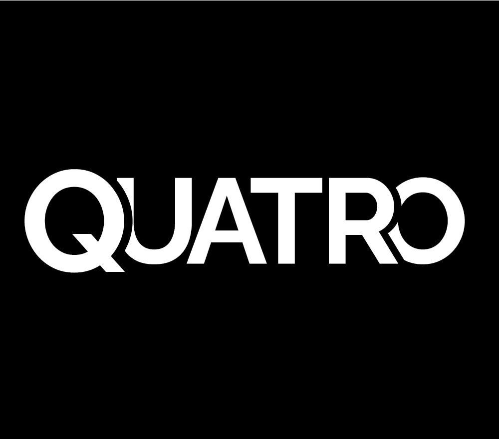
Creating the logo for my Quatro Rebranding assignment was a stimulating challenge that demanded creativity and strategic thinking. With the task of revitalizing the brand's image, I knew the logo had to be more than just aesthetically pleasing; it had to embody Quatro's values and resonate with its target audience.
Drawing inspiration from Quatro's rich history and heritage, I embarked on extensive research to understand its core essence. I explored various design elements, color palettes, and typography styles to find the perfect balance between tradition and modernity.
After numerous brainstorming sessions and sketching out countless concepts, I finally found the spark I was looking for. The logo needed to symbolize Quatro's evolution while honoring its roots. It had to be dynamic, versatile, and instantly recognizable.
With this vision in mind, I began experimenting with different shapes and symbols, striving to create a design that would capture Quatro's essence in a single emblem. I played with geometric forms, incorporating elements that reflected the brand's values of innovation, quality, and reliability.
As the design began to take shape, I sought feedback from peers and mentors, fine-tuning every detail to ensure it aligned with the brand's objectives. Each iteration brought me closer to the final logo—a bold, contemporary mark that encapsulated Quatro's spirit of progress and excellence.
Presenting the logo to my professors was a nerve-wracking yet exhilarating experience. As I explained the concept behind the design, I felt a sense of pride knowing that I had successfully translated Quatro's identity into a visually compelling symbol.
Receiving positive feedback and constructive criticism fueled my determination to refine the logo further, pushing the boundaries of my creativity. It was a testament to the power of design in transforming perceptions and shaping brand identities—a lesson that would stay with me long after the assignment was complete.
